How to turn forgotten error pages into worthwhile pages?
Case study2020
DeviceWeb
RoleSenior Product Designer
Introduction:
Probably some of you pay attention to the error pages and some do not!In this case study, I've simply covered a successful idea for designing error pages that, according to our data analysis, have worked well for our product (Aparat).
Aparat is an Iranian video-on-demand service similar to YouTube, that attracts more than 60 million monthly viewers.
Ideas that turn forgotten pages into important product pages, pages that can leave your lost user alone, or best cater to them and even become your customer!We need to know that error pages like 404, 500, and… are landing pages of your product that no one wants to land there!Why? The answer is so easy, the user has searched for something on the net, then found the link (a blog post, news, video, or…) and just when he clicks on the content to read or watch, encounters an error page titled 404. Discomfort and confusion are the first feelings the user experiences then which leads to a bad experience of using your product for the user, if we fail to pay attention to this feeling of the user, we may not be able to host that user once again!
“ Think of 404 as essentially a landing page. Then think about how much more work goes into a regular landing page than an error page. A well-designed 404 page can make a huge difference in how a user experiences a brand. A bad one is a missed opportunity. “Justinmind
Define Problem:
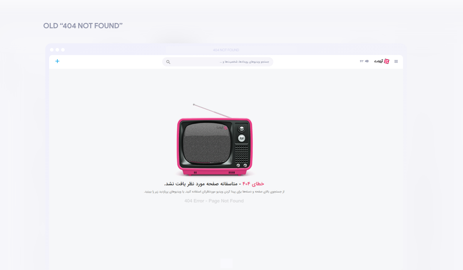
For a short time, due to various changes in the infrastructure sector, users of our product were more likely to face pages 404 and 500 on Aparat. This factor increased their sense of discontent, so they shared their feelings on social media.We found out from users' feedback that the 404 error page is no longer able to reduce the amount of dissatisfaction to users. Therefore, This led me to check the pageviews and exit rate of this page.
Research:
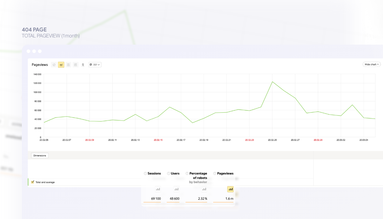
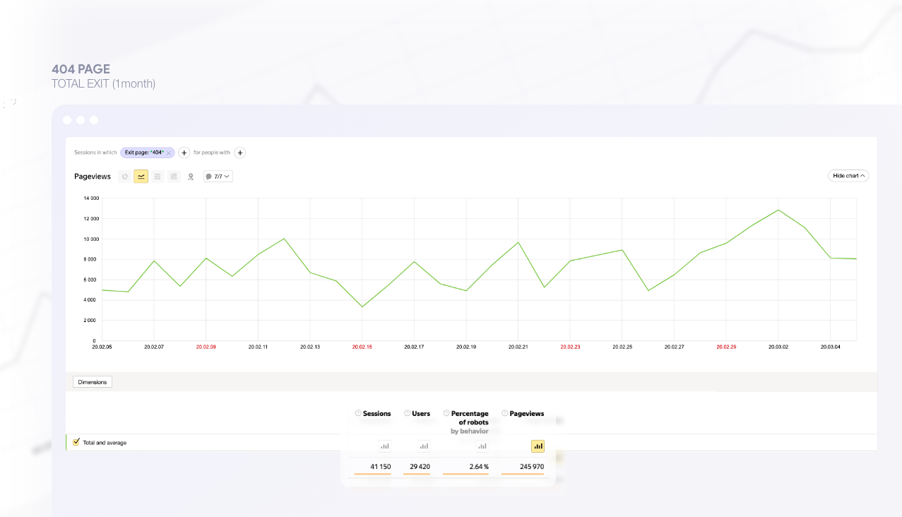
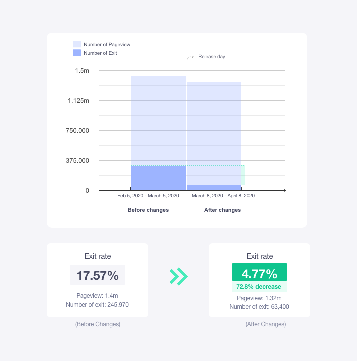
Then, we gathered data on the Aparat "404 Not Found" page and measured the number of pageviews on this page to understand the importance of redesigning it. This page receives a significant amount of pageviews as well as a medium exit rate:
Data analysis showed there was a possibility of reducing the exit rate, which means our 404 Page would be able to better overcome bad feelings and bad experiences of users to keep more visitors on the platform.
Beginning & Ideate:
Having studied and reviewed various case studies on error pages, we came up with some good conclusions. For example, it is common for content-driven sites to display a number of suggested content instead of content that no longer exists on 404 pages.Thus, I developed these useful ideas and asked myself: How can we minimize the bad experience users get when they encounter "404 Not Found"? This case study answers this question a little forward in the Result section.My objective in reviewing ideas on this page was to find which idea received the most positive feedback and the most impact on our data. so that we could design the visuals, consider the UX Writing and sort the page content around that idea. Among all the ideas, the most logical idea I came up with was:
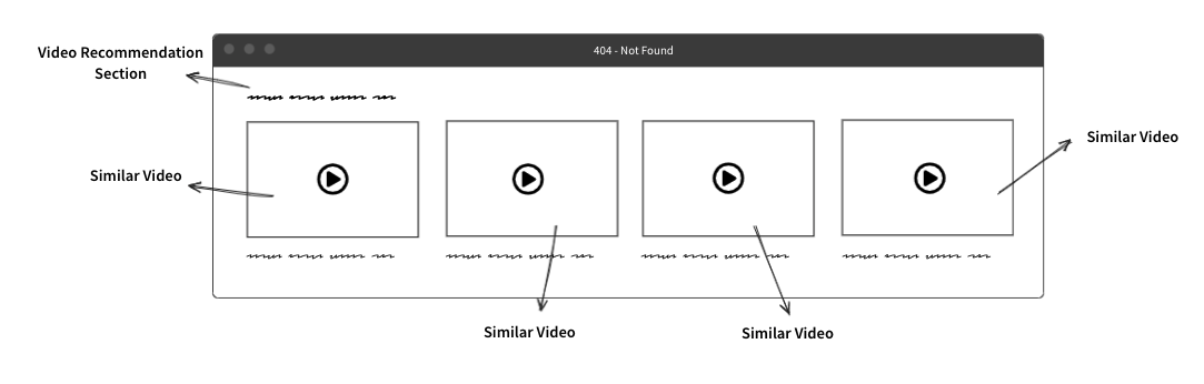
Placing the "videos recommendation" row on our 404 page.
but the question was, should videos on this page choose randomly? Should they be based on user interest? Or even a combination of trending videos and user interests?This was the question we decided to conduct the A/B test.
A
B
Design:
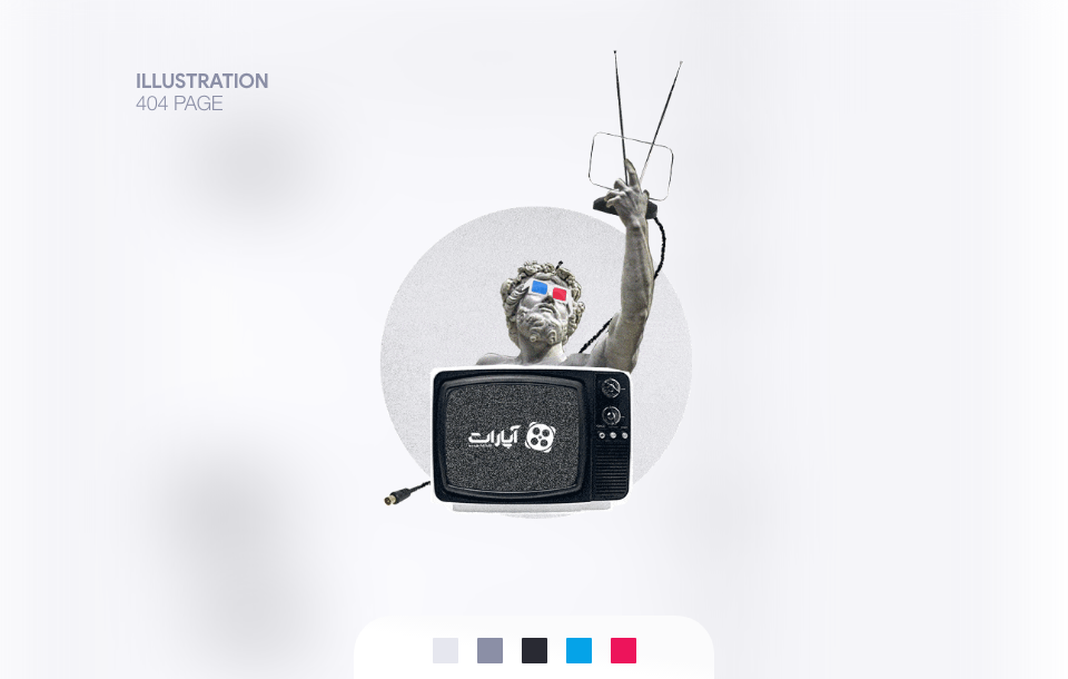
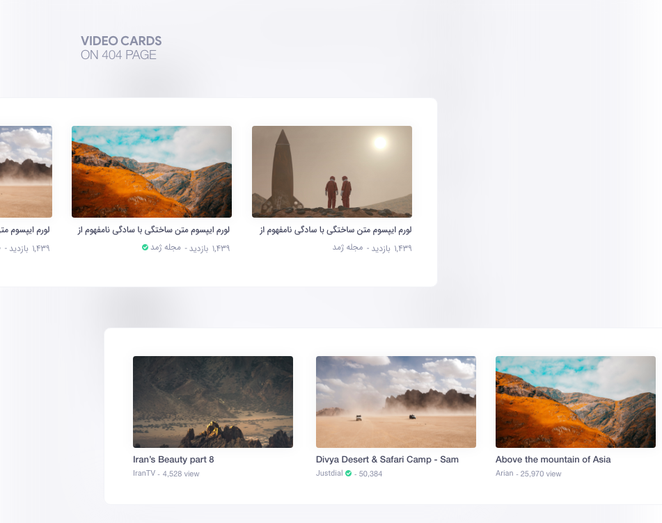
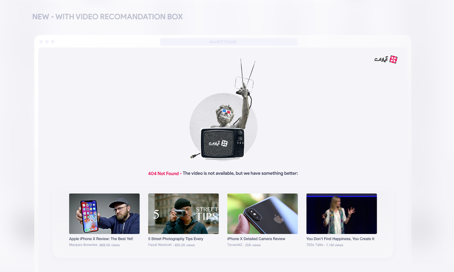
The design of this page was adapted to the design style of our platform. I used a collage technique. As much as possible, I tried to use humor and creativity in designing the visual element in order to reduce the amount of dissatisfaction the user will experience. A little motion was added to make it more enjoyable, as well!
Let’s get back on the track:
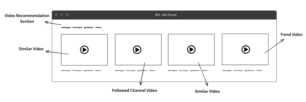
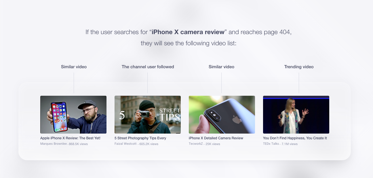
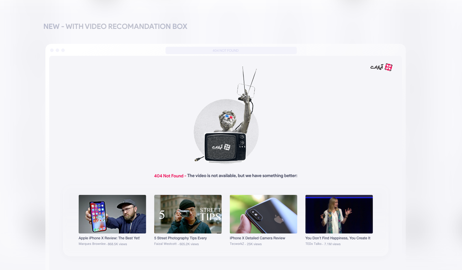
Well, We simply put a group of four videos in front of the user on page 404, and these videos were a mix of different content: 2 videos similar to what the user was looking for, 1 video of the day's trends, and 1 video from channels user followed.
When a user searches for "iPhone X camera review", and lands on page 404, Two of the four videos he sees on the page are about iPhone reviews (similar content), one of them is from the channel user followed and another one is one of the trending videos. as you can see below:
So, the visual design of page 404 and its content was completed, and now we had to look at the result of our changes on this page.
Result & Test:
The new version of page 404 was released and data analysis began. After a month, the data analysis team compared the new and previous designs and determined that the exit rate had gone down by 72%! As a result, the product will remain in use by around 180,000 people each month.
A/B Test:
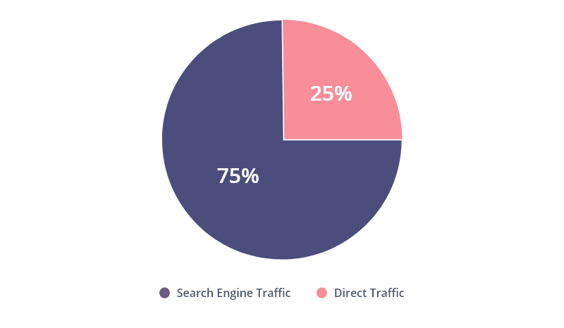
In addition, we also thought that if all of the videos displayed to the user were from videos similar to what they searched for (B), we would probably get better feedback than before in reducing the exit rate, so we conducted an AB test.The result was contrary to what we thought. Not only was it not positive, but also it declined! but why?A closer look at users' data and traffic sources revealed that 75% of people who encounter a 404 page come through search engines (Google) and 25% through direct traffic.
This change was only useful for those who came from Google, not all users.From this change, we have observed that someone entering from a search engine is clearly looking for content related to the search term, however, someone who enters directly (for example, by clicking a link shared on social media), won't be looking for similar content and should be persuaded to stay on the site by trendy and attractive videos instead of one that doesn't exist.
Conclusion:
Well, How can we minimize the bad experience users get when they encounter "404 Not Found"?
Here are the factors that can help you through the solving this problem.
1- Minimize the user's discomfort and confusion in order to reduce the number of users leaving the website (bounce rate):
It is better to empathize with the user and let him know that you are aware and sorry that this problem occurs.
Try to write the reason why the user landed on this page or mention some possible reasons.
Be funny and be sure to use creativity and visual element in designing this page in the simplest way, in addition, try to add a little humor to your design.
Because the pleasure of watching a fun and entertaining image can reduce the user's dissatisfaction with a little smile! Just as a sense of empathy and knowledge of the reasons for landing on the page can also create a sense of trust in the user.
2- Persuade users to do something else:
Not just getting them out of the way, but helping them find other similar content on your website. The search box display is suitable for content-based products, such as blogs, video sharing, etc. and the better idea is to use content similar to what the user is looking for, such as placing a row of similar articles or videos in front of the user to persuade the user to stay on the website!
After more than seven years of designing, improving, and optimizing digital products, I decided to seek new experiences and prepare myself for international challenges.
The launch of the DSP service was the most important project for the Aparat service in 2021 and 2022. It allows businesses and individuals to distribute their advertisements across the platform automatically.
"Teams" is a social network application for amateur football players. "Teams" enables people who wish to play football but do not have enough friends or teammates to form teams and attract similar players...
It's been a while since the launch of the service, and we were driving mass traffic to our landing page, where users who landed on the landing page were all directed there by clicking on the marketing's banner ads.
The better and more accurately we explain and introduce the DSP service to users on its landing page, the more customers we will add to this service, which is directly related to the increase in the revenue of Aparat.
It is well known that the notification system plays a vital role in enhancing user interaction and engagement rate with products. If I wanna deal with this project quickly, I must point out that "Aparat" did not utilize a proper notification system.
SnappMarket had been operating in the Iranian market for over two years, and due to its rapid growth, it realized that there was a need to improve its quality in order to provide users with better service...
Think of 404 as essentially a landing page. Then think about how much more work goes into a regular landing page than an error page. A well-designed 404 page can make a huge difference in how a user experiences a brand.