How to convince the Marketing team their designs aren’t good enough!
Case study2022
DeviceWeb
RoleLead product designer
Introduction:
Many of you may have experienced inter-team challenges, that are sometimes exciting and sometimes boring. For example, the usual challenges between the technical team or the product with the marketing team!In this case study, I'm going to share with you, based on my experience with the Aparat product, the best way to solve this problem.As we all know, usually, the technical and product team are responsible for the maintaining and improvement of the product services, and the marketing team is responsible for promoting product updates or introducing new product services.It all began when we introduced a new feature on "Aparat" to help users who wanted their videos promoted on the platform. This service allows users' videos to reach more audiences. (such as the Boost feature on Instagram)Our most important project in 2021 was to launch this feature. Both the dashboard design and the landing page design took a lot of time and attention.Now, it is time to promote this service, where the marketing team and its designers must do their best to promote it.It's been a while since the launch of the service, and we were driving mass traffic to our landing page, where users who landed on the landing page were all directed there by clicking on the marketing's banner ads.
Not a good design:
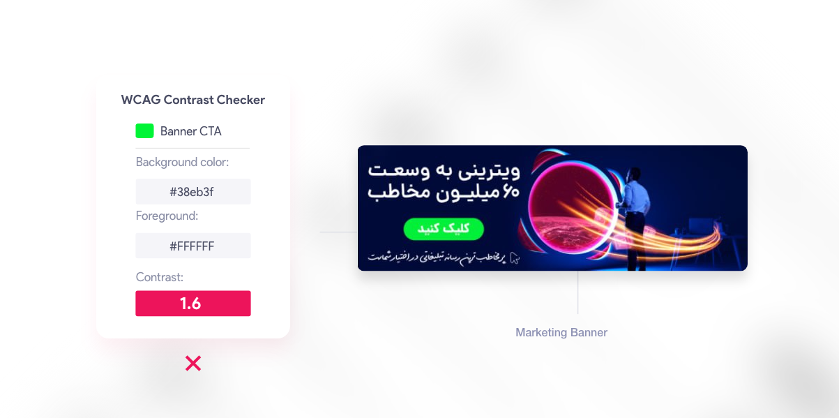
When I first saw the banners they designed for the service ads, I was a little surprised since they did not follow the principles of colorology and, furthermore, bore no resemblance to our landing page and its dashboard, meaning, Our service identity could not be found in these banners.This makes the user feel weird after clicking and landing on the landing page, and it’s possible the user thinks he has lost his way! cause the banner he clicked on is a picture of a person looking at a logo and the predominant colors of the banner are blue, red, and phosphorescent green, after seeing these colors for a moment, he has landed in a place where its images are completely different and predominant colors are green and white. So the user won't see any banner's identity he clicked on, in the landing page.
Marketing banner
Therefore, I checked the banner conversion rate and found that it was extremely low, as I expected.
Some changes:
Given the importance of our new Product Feature to me and my team, I felt compelled to contribute to the marketing team to prevent traffic loss and a low CTR.
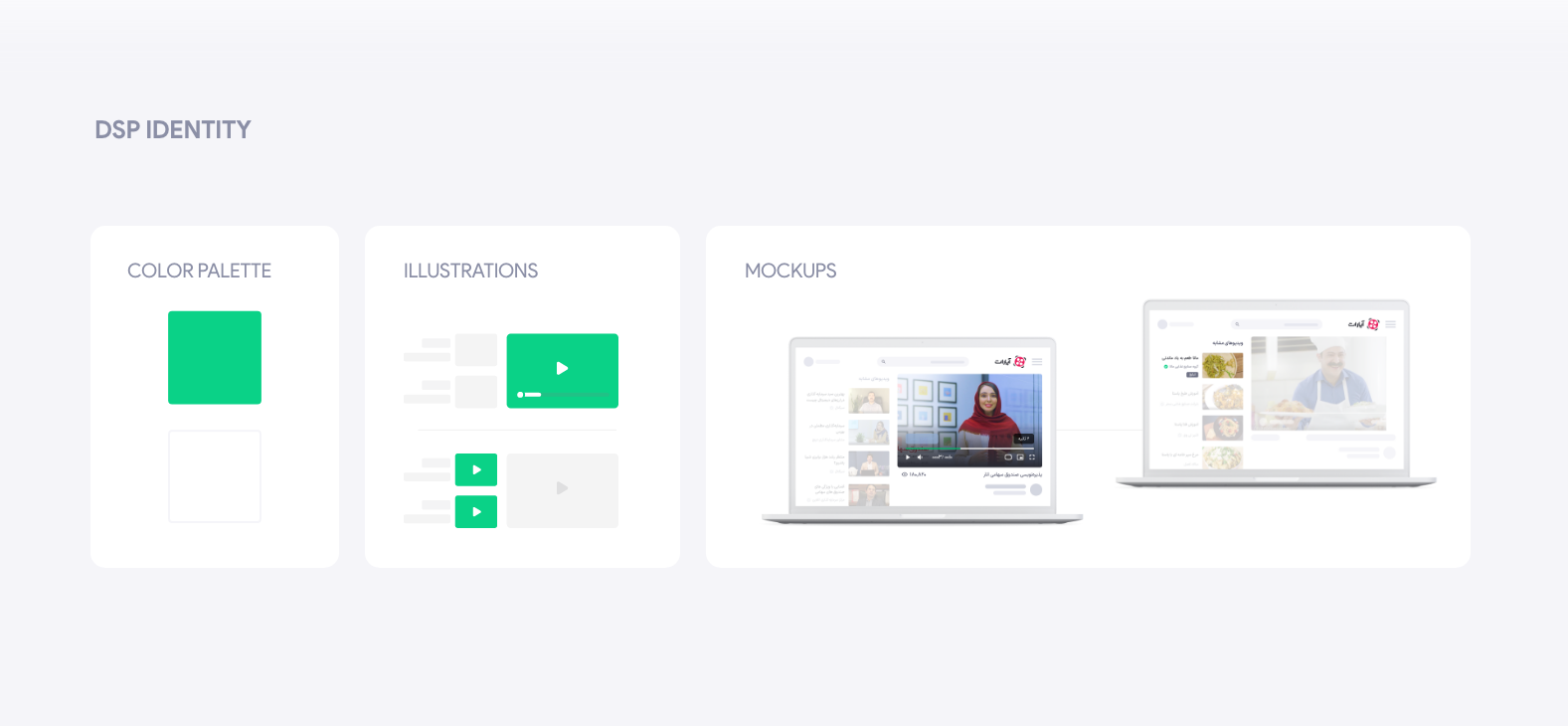
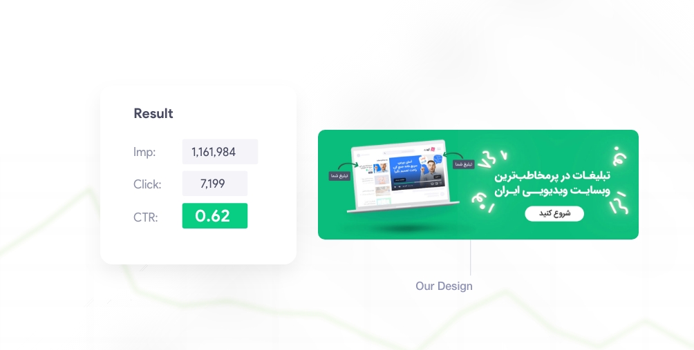
DSP Service identity
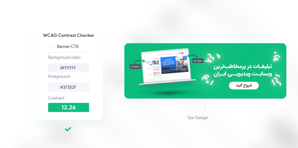
Using the landing page and DSP identity, and considering WCAG design principle, we designed a straightforward Banner very quickly and sent it to the Technical and the Performance teams for AB testing.
Result:
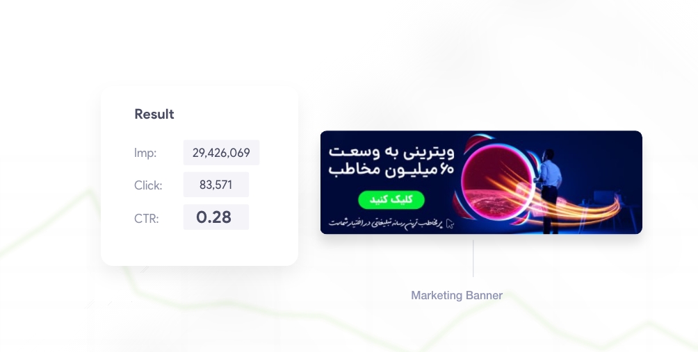
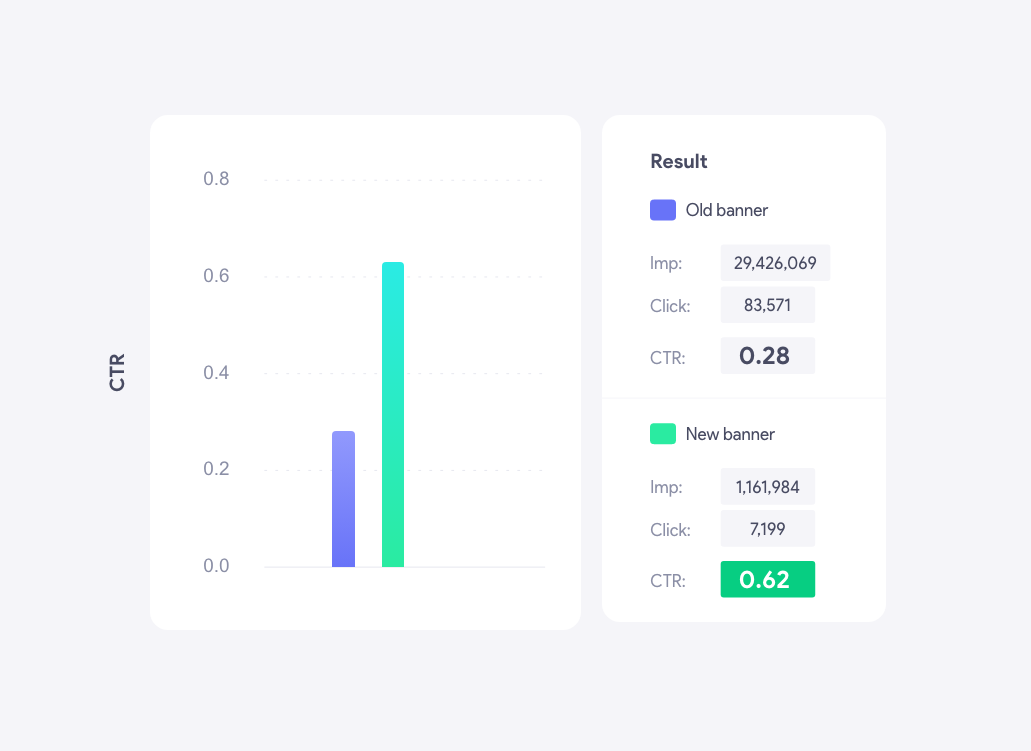
After gathering data for a few days, we checked Click-through rates and compared the Marketing team's banner (version 1) with the banner we designed (version 2):
We experienced a 121.4% increase in click-through rate with our banner (version 2).
Conclusion:
Several important points emerge from this test:
The product and service identities must be protected wherever they appear (whether inside or outside a product and its advertising).
colorology and compliance with web accessibility standards (WCAG)
Creating a powerful call to action
Using images that reflect the service's goals and vision
After more than seven years of designing, improving, and optimizing digital products, I decided to seek new experiences and prepare myself for international challenges.
The launch of the DSP service was the most important project for the Aparat service in 2021 and 2022. It allows businesses and individuals to distribute their advertisements across the platform automatically.
"Teams" is a social network application for amateur football players. "Teams" enables people who wish to play football but do not have enough friends or teammates to form teams and attract similar players...
It's been a while since the launch of the service, and we were driving mass traffic to our landing page, where users who landed on the landing page were all directed there by clicking on the marketing's banner ads.
The better and more accurately we explain and introduce the DSP service to users on its landing page, the more customers we will add to this service, which is directly related to the increase in the revenue of Aparat.
It is well known that the notification system plays a vital role in enhancing user interaction and engagement rate with products. If I wanna deal with this project quickly, I must point out that "Aparat" did not utilize a proper notification system.
SnappMarket had been operating in the Iranian market for over two years, and due to its rapid growth, it realized that there was a need to improve its quality in order to provide users with better service...
Think of 404 as essentially a landing page. Then think about how much more work goes into a regular landing page than an error page. A well-designed 404 page can make a huge difference in how a user experiences a brand.