Redesigning the landing page increased conversion rates by 78%.
Case study2022
DeviceWeb
RoleLead product designer
Introduction:
First, we need to know what the DSP service is.A demand-side platform (DSP) is a type of software that allows an advertiser to buy advertising with the help of automation. They allow advertisers to buy high-quality traffic at scale with minimal friction, DSPs are a powerful marketing automation tool.
Launching the DSP dashboard on our product “Aparat” was my most important project in Aparat in 2021 that you can read about it in my previous article.
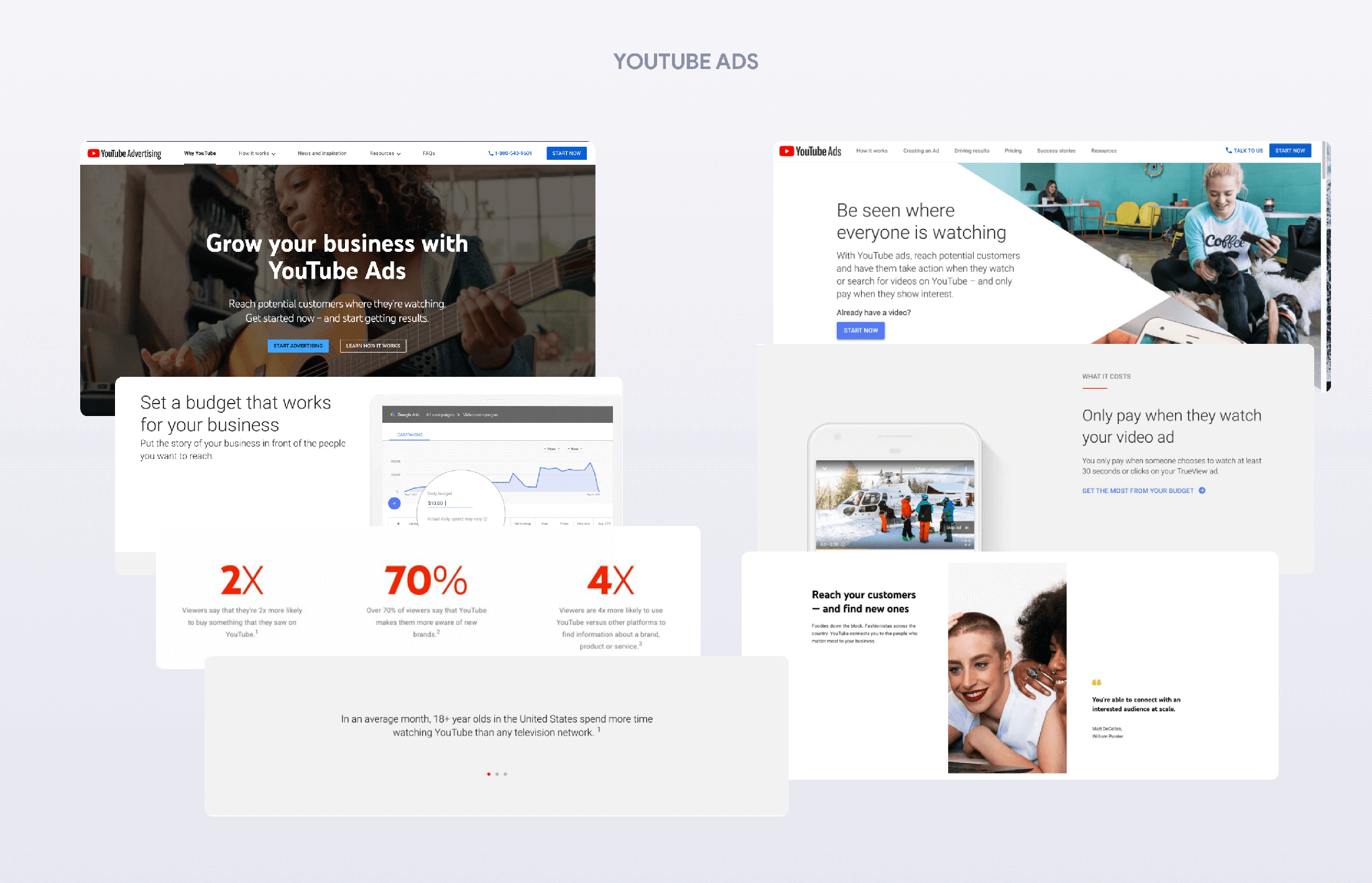
One of the pages that helps to lead the user to the DSP service is the landing page introducing this service, something similar to the YouTube Ads page.This landing page is responsible for introducing the DSP service to users and transferring users to the Ads creation process, as well as converting them from users to customers of Aparat's DSP service, and is considered as one of the most important pages of any product. If properly designed, The landing page that is business-oriented can lead to growth, increase the number of active ads in the product, and therefore increase revenue.You probably have an idea what I'm writing about,the landing page design of the Aparat DSP service.
My Role:
My role in this project as the head of the Aparat product design team:
Maintaining and focusing continuously on increasing the conversion rate of landing
Making designs more reasonable and more aesthetic.
Assisting product designers with benchmarking.
Communication with the UX Writing team to prepare appropriate texts that reflect our personas and tone of voice.
Select the content that users on this page are seeking, by performing user experiments.
Analyzing the data to continuously monitor the landing user experience and user interface.
Research:
As YouTube spent a lot of time designing and reviewing the data on Youtube Ads landing page and doing a lot of testing on this page, the long journey of designing and continuous improvement of this Landing page was felt from the beginning. Because our most important communication channel with users who will probably become DSP service customers in the future, is this landing page, and after the launch of this page, we are going to put mass traffic on it so that Aparat users are well acquainted with the service.The better and more accurately we explain and introduce the DSP service to users on its landing page, the more customers we will add to this service, which is directly related to the increase in the revenue of Aparat.After reviewing the landing of advertising services for various products, such as YouTube Ads, Twitter Ads, and Instagram Ads, and…, during a few sessions with team members, we identified the important and useful points of each landing page to be inspired by them in our design:1- Using real images (which we have read many times in various user experience design articles about its impact)2- Creating a sense of trust and transparency in using the service and paying for advertising (Only pay when they watch your video ad)3- Providing useful data for businesses (viewers say they’re 2x more likely to buy something they saw on YouTube)4- Use the appropriate tone of voice for the target audience (Be seen where everyone is watching)5- Providing facts about the audience and their experience of your Ads service (In an average month, +18 year olds in the United States spend more time watching YouTube than any television network)And many other important points…
Kick-Off:
As soon as the content and tips were determined, we began designing the Landing page to help users identify our service.
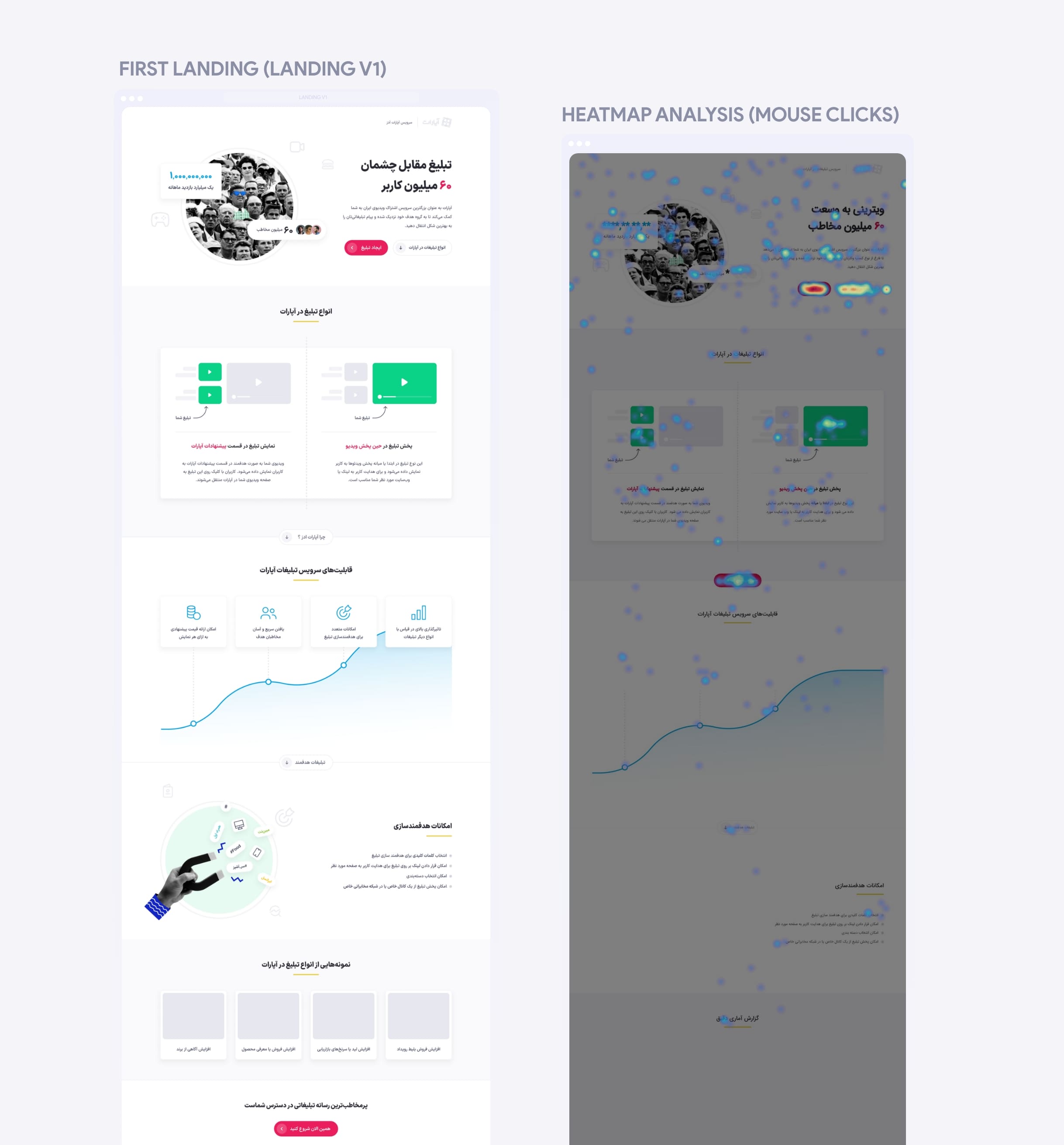
Initially, we designed a landing page for this service before conducting proper research, due to lack of time, and after a period of time, based on the data review, we decided to redesign it because of the following problems:
Conversion rate that could be higher
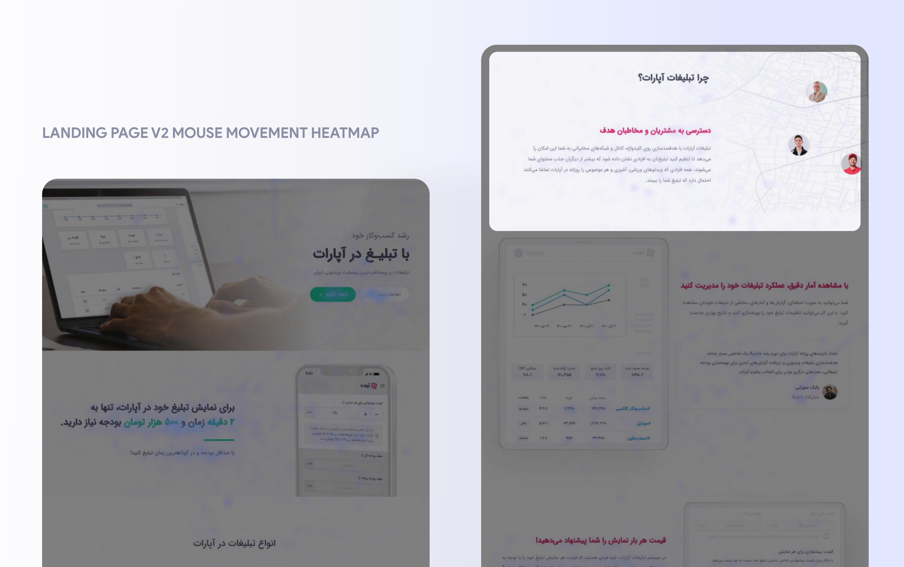
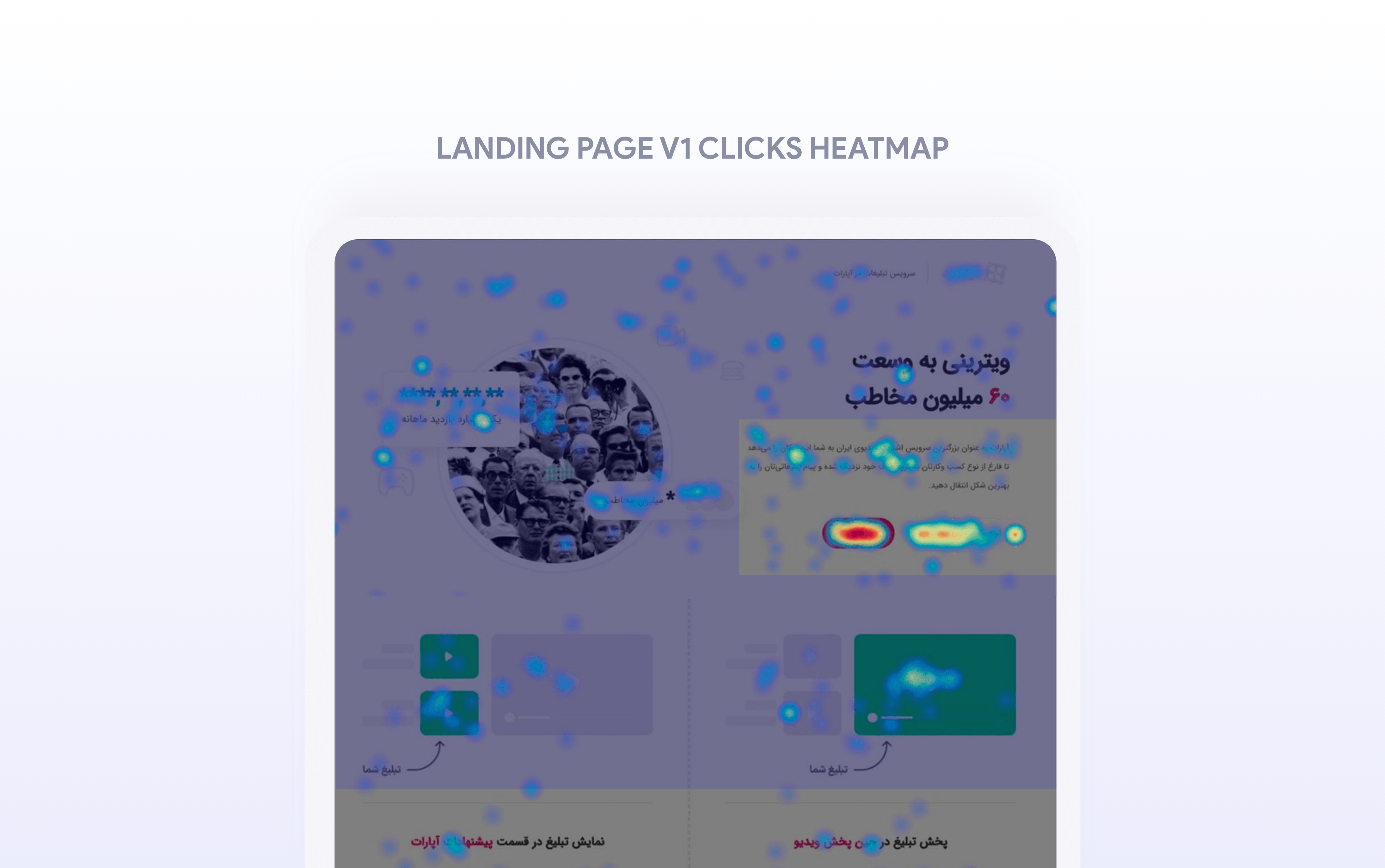
Low user interaction with the landing page (which was well defined in the heat map.)
Existence of non-interactive sections
Design incompatibility with its dashboard identity
Lack of potential to add various descriptions and sections to the landing
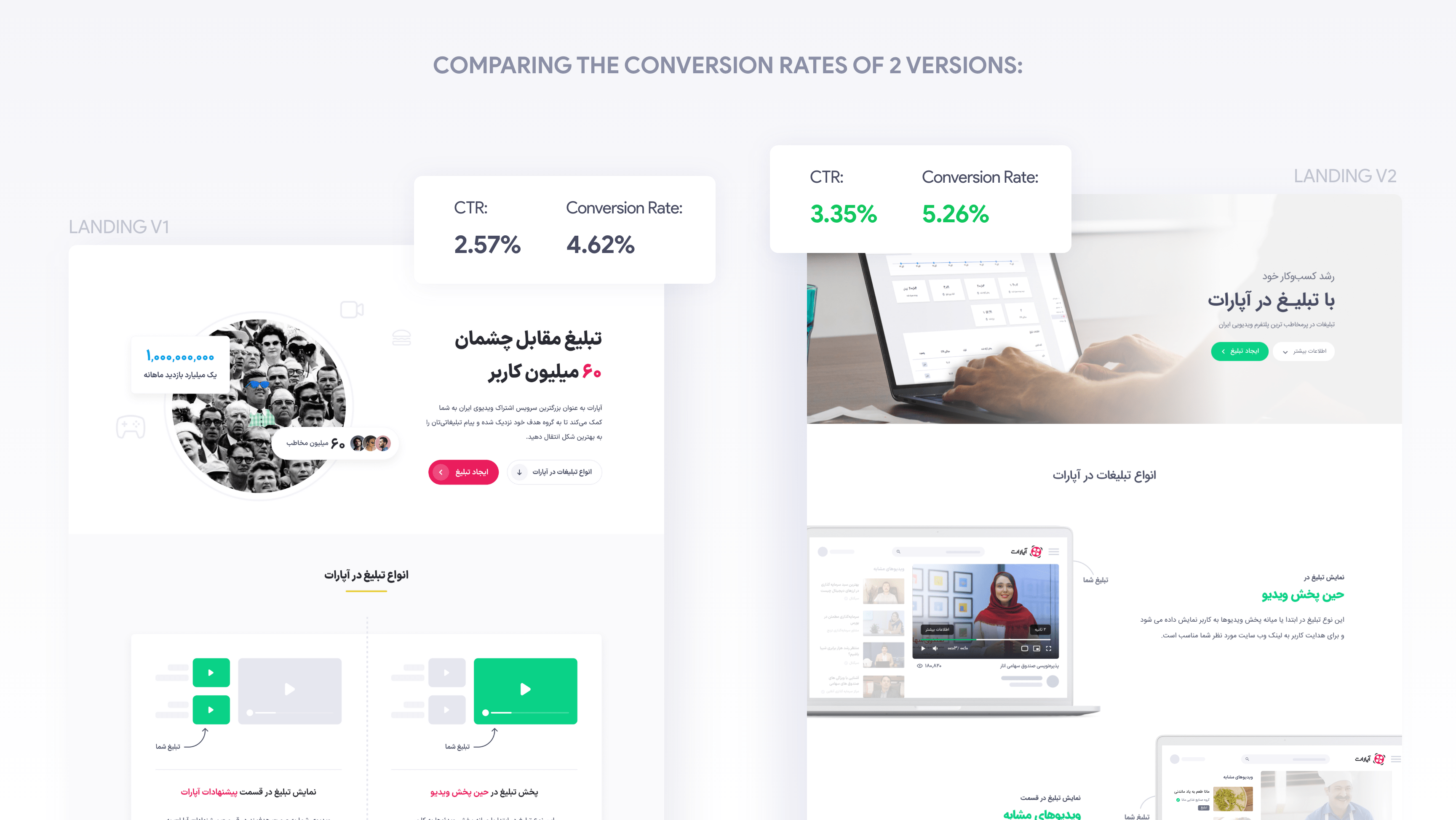
As a result, I decided to redesign the landing page to solve the previous problems. What you will read below is the process of redesigning the landing page and finally comparing the first landing with the redesigned (second) landing.
Redesigning:
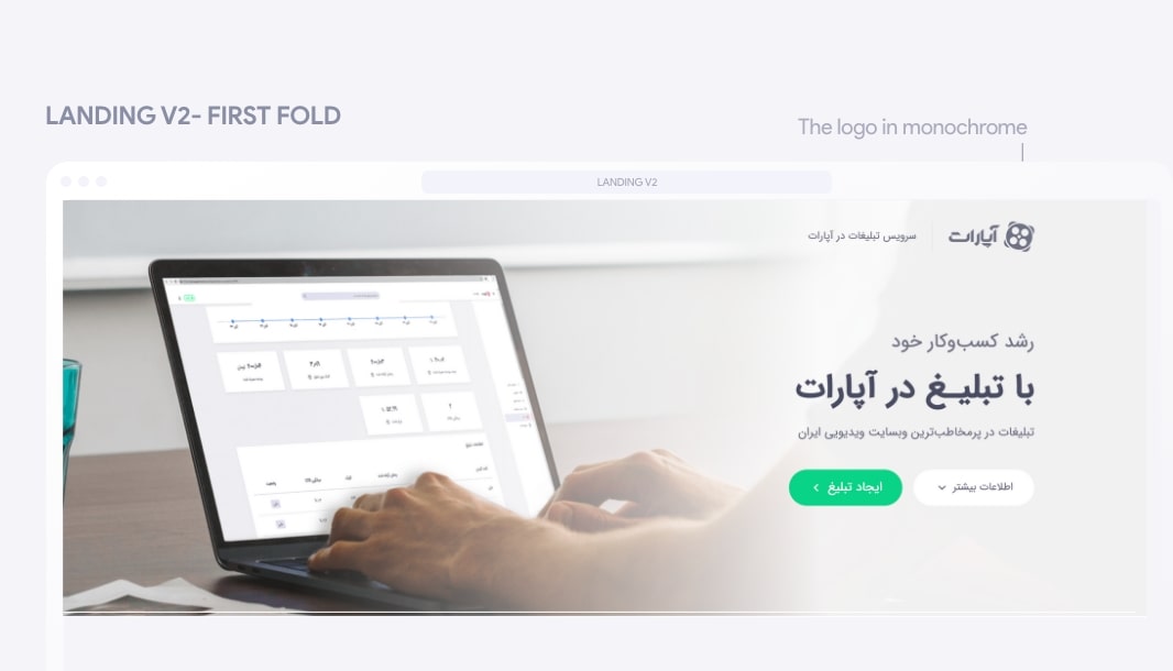
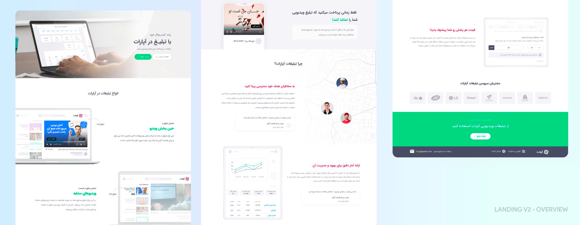
In the beginning, I asked the team members not to underestimate the impact of the first fold on users. The first fold should be designed to both direct the user to the Ad creation process (for users who are familiar with the service and want to get into the ad creation process quickly) and to keep the user inside the page to read more about the service. Also, this fold should be free of any deterrents for the user, such as not using too many graphic elements or using too many options.So, in the first section, two buttons Primary and Secondary were used. The primary button guided the user through the Ad creation process and the Secondary button guided the user to the bottom section.In addition, no other options were placed in this fold, and even the service logo was placed in one color to keep the user's attention on the content.
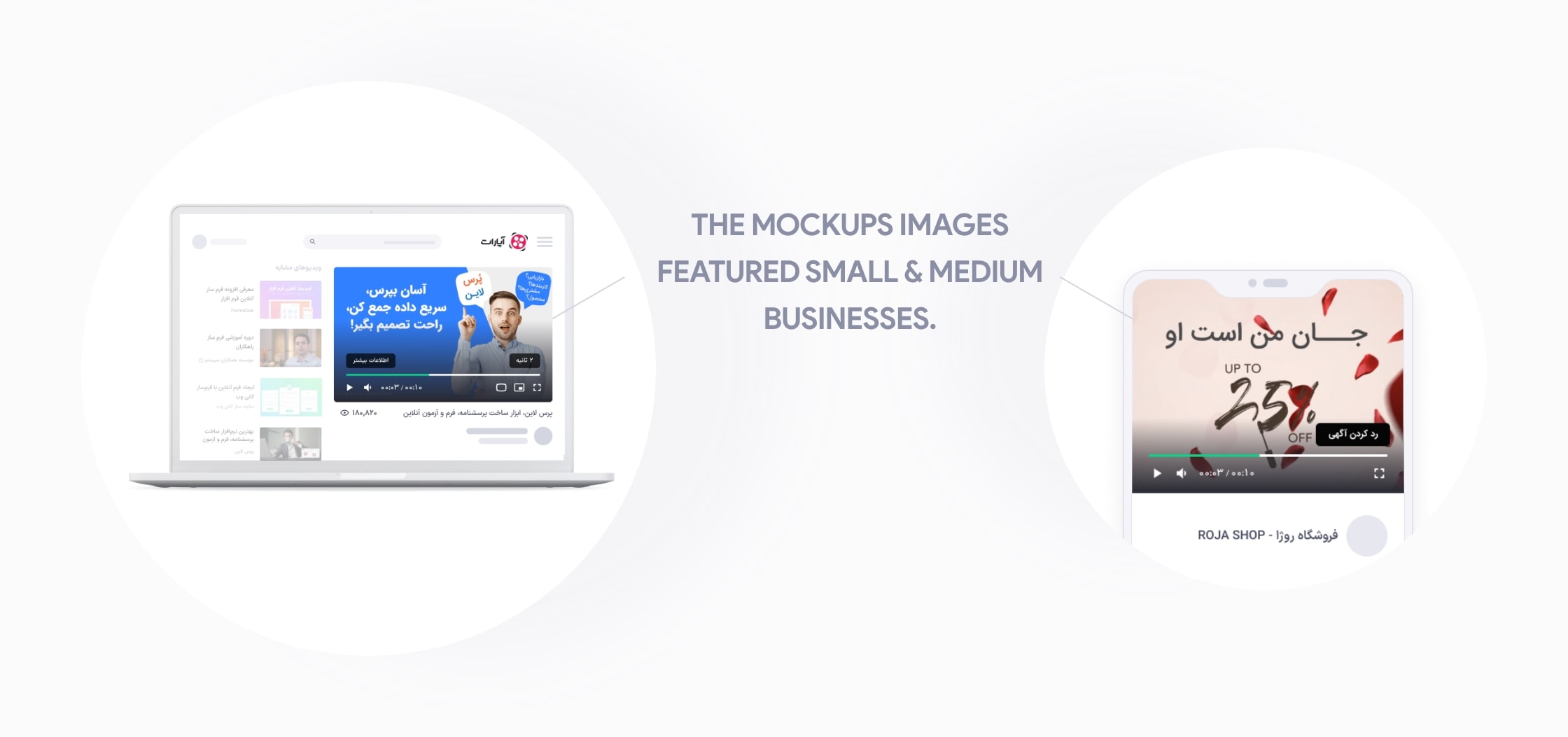
In the second section, we announced the cost of advertising, and in the third section, we introduced the types of advertising to the user. According to the good points, we got in the research process, we used real product images in designing all sections.We also used small and medium business images in mockups to introduce various types of Aparat ads so that we can make users realize the suitability of this service for small and medium businesses because one of our purposes in designing DSP service was to attract small & medium businesses as well.
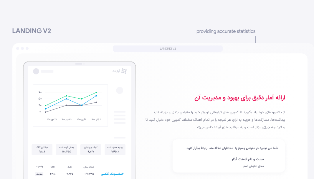
Then there's a section titled "Why should you advertise on Aparat?" To show the main features of DSP Ads Management in this section to users.Delivering ads to the right people, providing accurate statistics to improve and manage the ad, and the ability to adjust and change the price per view were some of the features that we introduced in this section. For a sense of trust, we included quotes from our customers about the benefits of this service.
To build trust and prove the quality of the service, we placed our great customers' logos next, and in the last section, we put the frequently asked questions (FAQ Section).
Result:
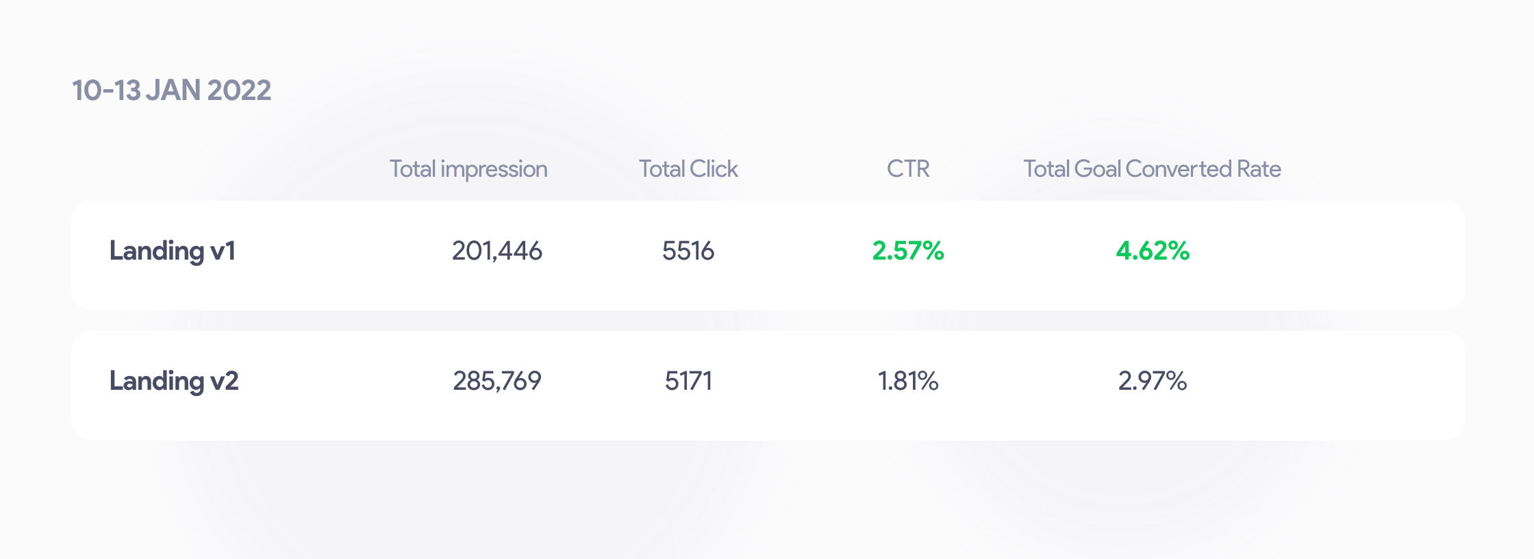
After a few days and collecting the data of the second landing, we noticed a decrease in the conversion rate of the new landing (V2) compared to the old landing (1)! What we did not expect.(note that we landed mass traffic to this landing page, which naturally has a negative impact on conversion rates, but it is quite useful for creating awareness.)
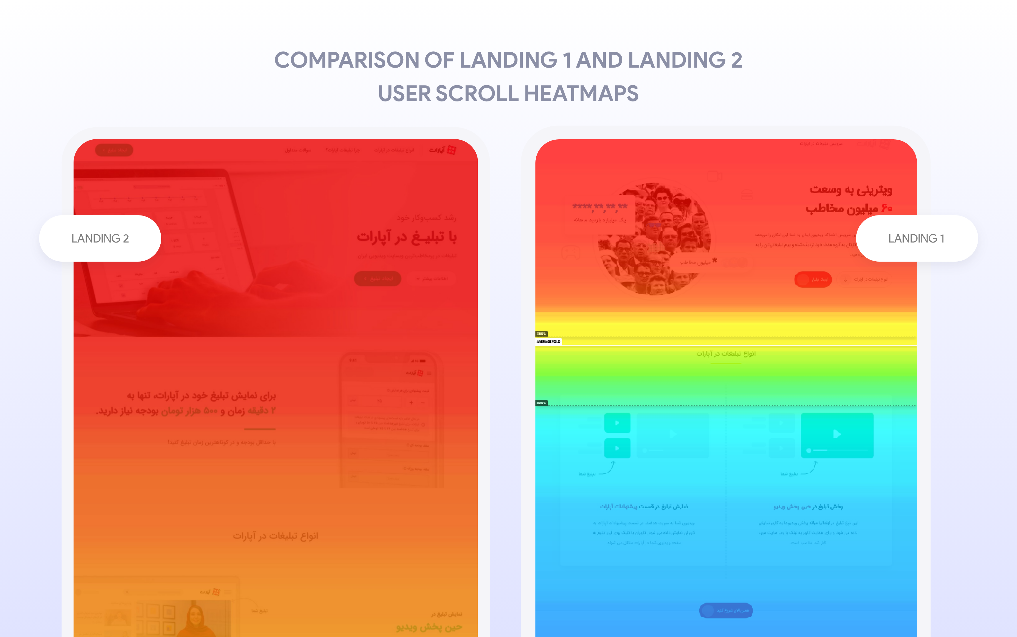
we came across some interesting cases by examining both landing pages' heatmaps :
On landing page 2, more users scrolled the page and saw more content from the landing.
CTA buttons in Landing 1 had more numbers and were clicked more often.
On landing page 2, there are sections that are not attractive to users and do not cause them to interact.
In landing page 1, the use of graphic elements leads to high spam clicks.
So, since the landing page 2 had a more logical structure, the potential for improved click-through rates was quite obvious given the data. Based on the data results, heatmaps, and session records, I wrote some A/B tests and asked my colleagues to design and prepare them so they could be run by the technical team, and reviewed by the Data (Performance) team.
A/B tests & Improvements:
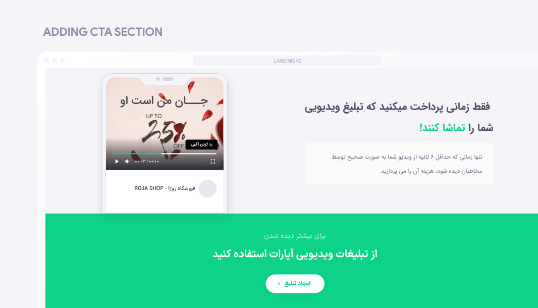
Test 1: CTA section
The first change that had to be made was to create a section to remind the call to action button, that would be placed in the middle of the landing page for users who do not want to read the entire content of the page to click and go on.
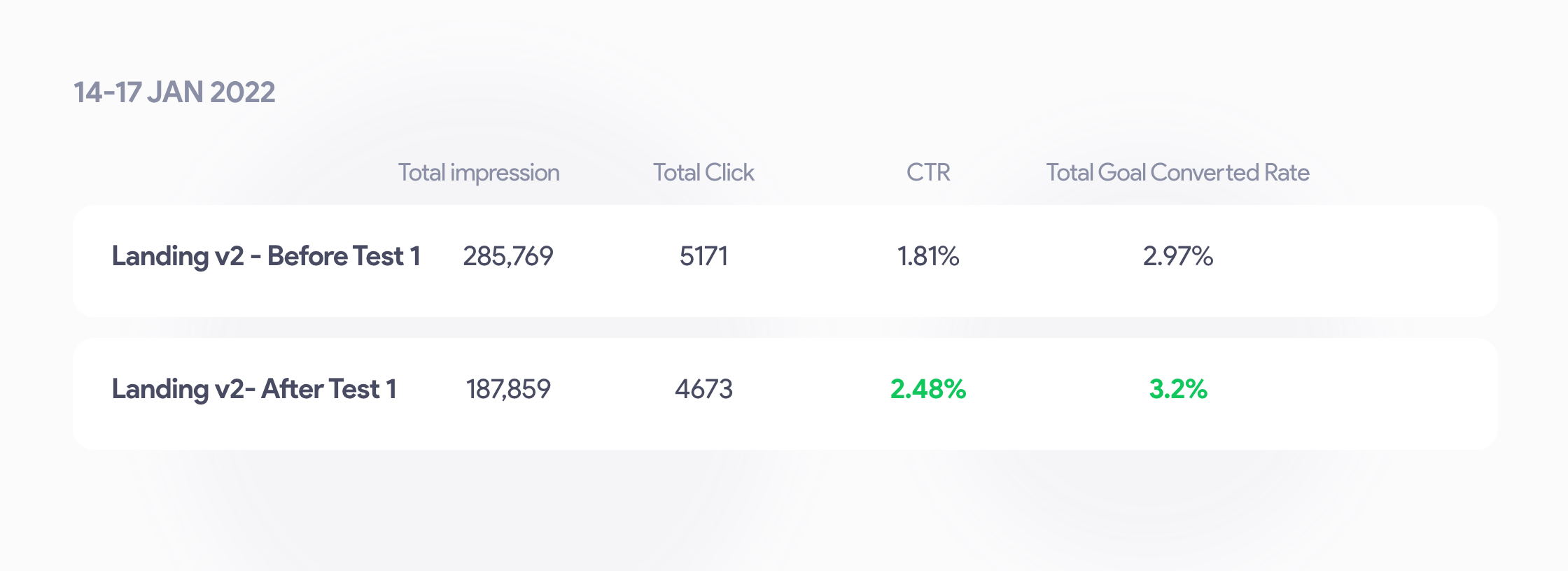
Test 1 result:
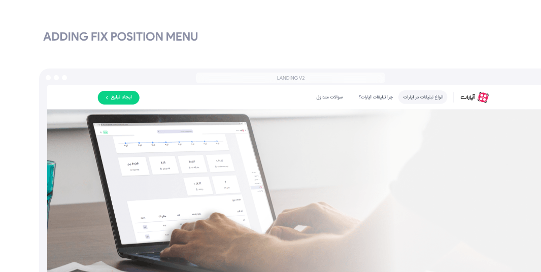
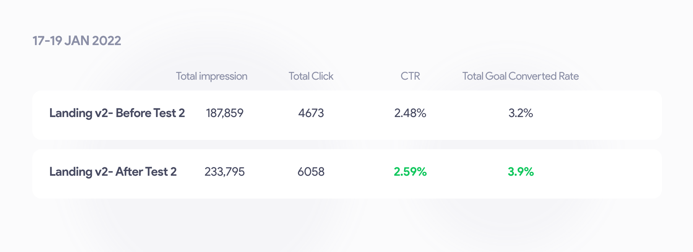
Second test: Fix position menu when scrolling
The second change is to create a fixed-position menu for better navigation between sections and, most importantly, permanently placing a strong CTA in the user fold!Whenever the user explores the landing, they will see a strong CTA in the fold.
Second test’s Result:
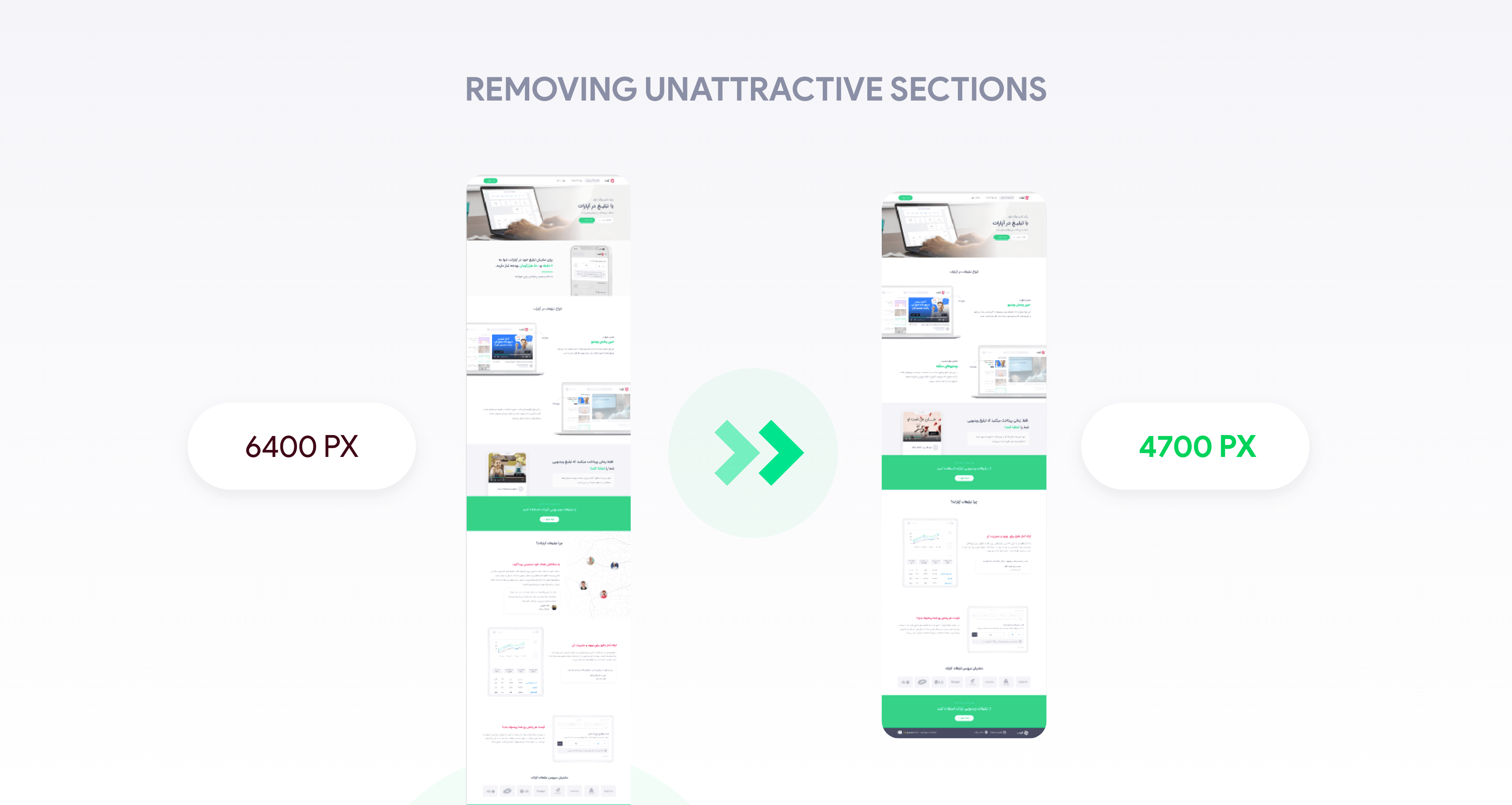
Third test: Unattractive sections should be deleted
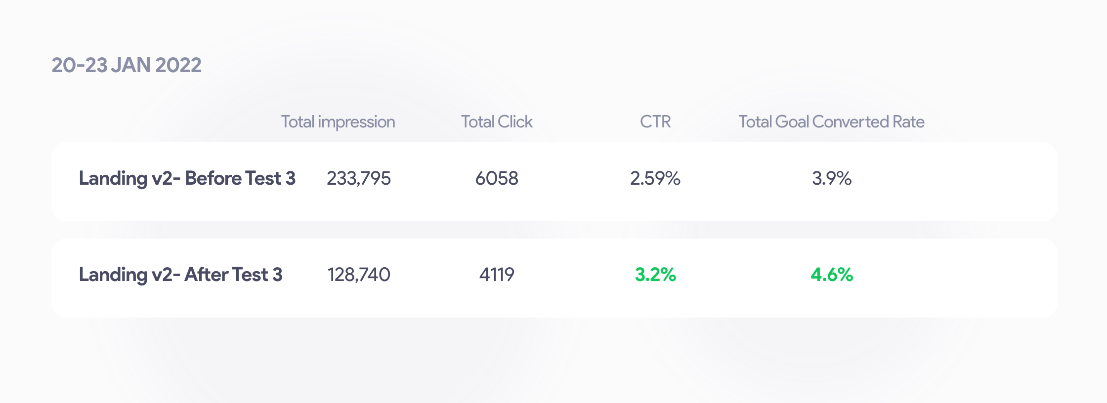
The third change is the removal of sections that were not useful or attractive to users (according to the heatmap and session records).To achieve this, the second section was deleted and its contents merged into the other sections. Due to low user acceptance, the "Delivering ads to the right people" section was also removed.This resulted in a reduction of landing page heights and the volume of content, which generally leads to an increase in conversion rates.
Third test’s Result:
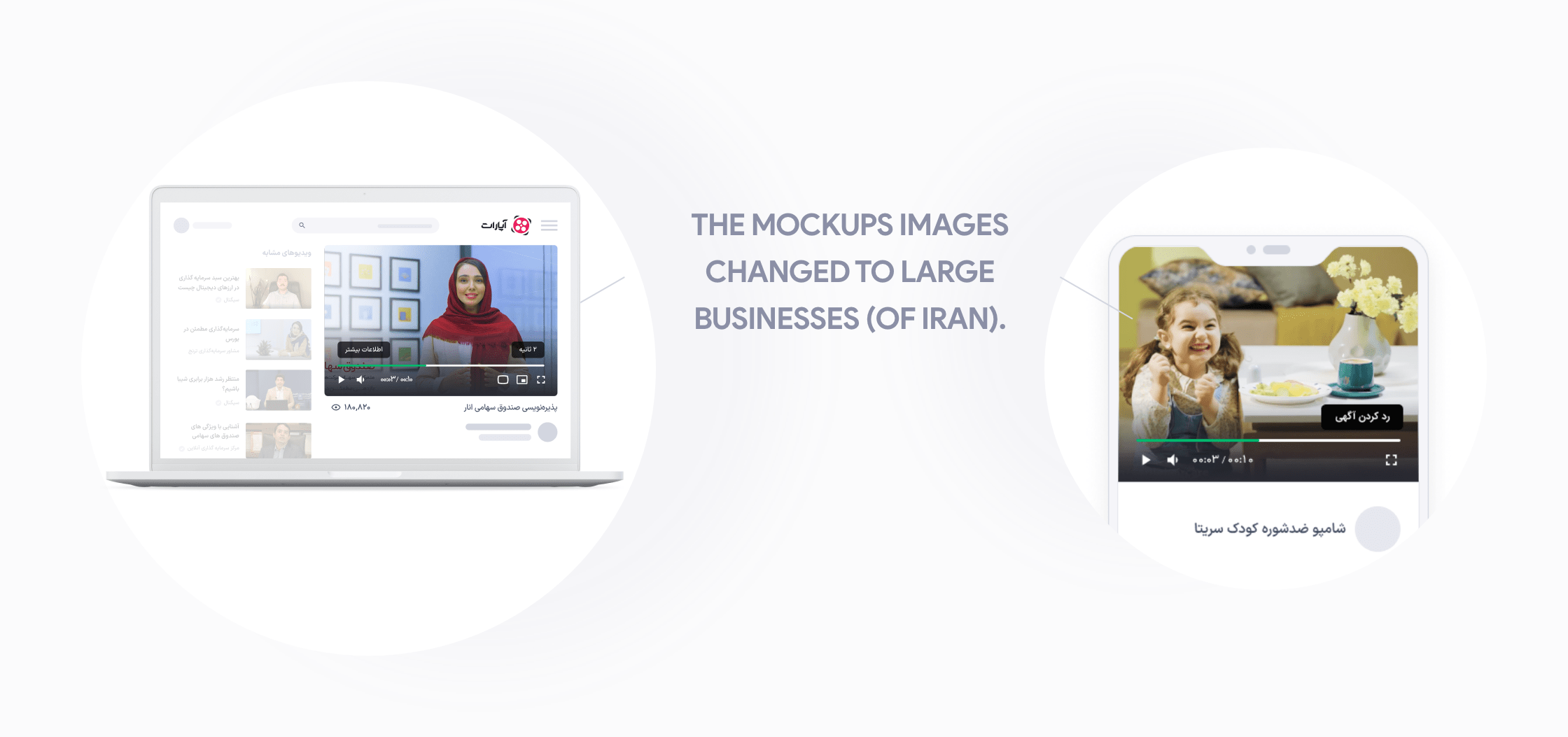
Fourth test: changing mockup images from small to large business photos.
Finally, the last change we made was to replace large business images in landing mockups with small and medium business images, which had a surprising effect, contrary to our original assumption.
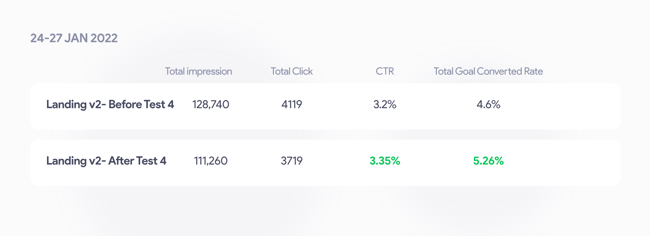
Fourth test’s Result:
Conclusion:
Therefore, during the 4 AB tests, I was able to increase the conversion rate of landing V2 from 2.97% to 5.26%, which equates to a growth of 77% and a 14% increase over the previous landing (1).
After more than seven years of designing, improving, and optimizing digital products, I decided to seek new experiences and prepare myself for international challenges.
The launch of the DSP service was the most important project for the Aparat service in 2021 and 2022. It allows businesses and individuals to distribute their advertisements across the platform automatically.
"Teams" is a social network application for amateur football players. "Teams" enables people who wish to play football but do not have enough friends or teammates to form teams and attract similar players...
It's been a while since the launch of the service, and we were driving mass traffic to our landing page, where users who landed on the landing page were all directed there by clicking on the marketing's banner ads.
The better and more accurately we explain and introduce the DSP service to users on its landing page, the more customers we will add to this service, which is directly related to the increase in the revenue of Aparat.
It is well known that the notification system plays a vital role in enhancing user interaction and engagement rate with products. If I wanna deal with this project quickly, I must point out that "Aparat" did not utilize a proper notification system.
SnappMarket had been operating in the Iranian market for over two years, and due to its rapid growth, it realized that there was a need to improve its quality in order to provide users with better service...
Think of 404 as essentially a landing page. Then think about how much more work goes into a regular landing page than an error page. A well-designed 404 page can make a huge difference in how a user experiences a brand.